Designing for
the unknown.
I am currently sole lead designer on a pre-launch AI product in the EdTech space - designed to bridge the gap between learners who need individual support and educators who can't always provide it in the moment. I've been involved from early research sprints to a world premiere that stopped the room.
My role
Sole lead designer- research, UX, visual design, systems
Sector
EdTech - pre-launch, commercially sensitive
Team
PM, engineering lead - daily collaboration throughout
Status
Coming soon World premiere complete
Note
Visuals anonymised - product is currently
pre-launch and commercially sensitive
The problem
The problem
Individual support at scale.
A problem nobody had solved well.
In any learning environment, giving each person meaningful individual attention isn't always possible. When someone gets stuck they often stay stuck, and the knock-on effect on confidence, progress, and engagement compounds quietly over time.
The tools that exist in this space tend to feel clunky, disconnected from the wider ecosystem, and difficult for educators to trust or act on. They solve narrow problems without considering the whole picture.
We set out to build something different: an AI product designed to make a complex, high-stakes experience feel intuitive and genuinely supportive for students, paired with an educator-facing layer that surfaces meaningful insight - without adding to an already stretched workload. We don't want to create something that is using AI as a replacement for human education, but offer a more sustainable way to extend it.
The learner side
How do you design an AI interaction that feels genuinely supportive? That's responsive to where someone is, without overwhelming them or making the experience feel clinical or robotic?
The educator side
How do you give educators meaningful insight into many learners at once without adding cognitive load? What does genuinely useful look like here and what can we do differently?
The trust problem
Educators need to trust that the AI is responding safely before they'll hand it to the people in their care. Trust has to be designed for and catered to - it can't be assumed.
Fitting the product family
This product sits within an existing product family. It needs to belong - while having enough of its own identity to reflect how genuinely different it is in purpose and feel.
My role
My role
Sole lead designer,
from almost day one.
I joined this project close to its beginning as the only designer on the team. That meant starting with research - delving into existing AI products in similar spaces, looking into AI product design patterns (which can often wildly differ from typical patterns we are used to using), and the specific challenge of designing responsibly for a younger audience interacting with an AI system.
From there I have been actively helping shape the user journey, the UX flow, the interaction model, and the visual design - working daily in close collaboration with the PM and Engineering lead, making decisions quickly and iterating constantly within a tight build timeline.
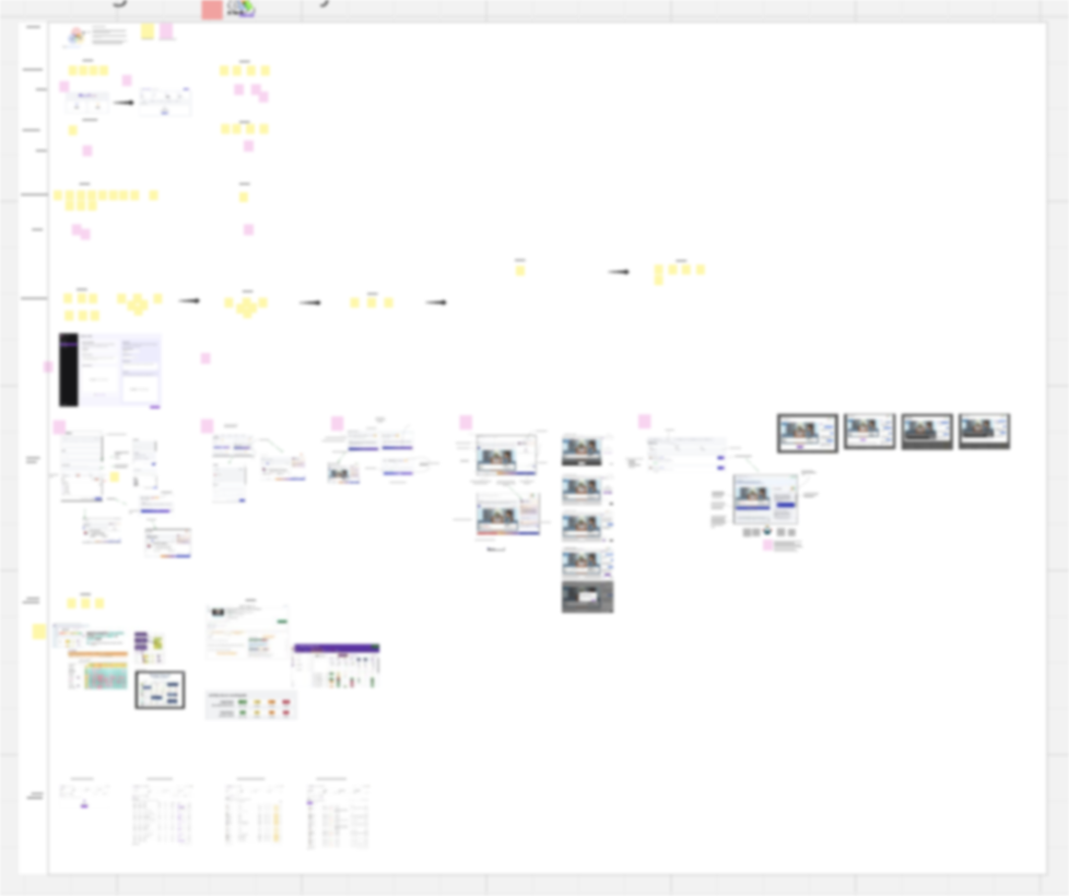
Early research, journey mapping, and product planning - the groundwork before any design decisions
When you're the only designer in daily engineering and PM conversations, your design decisions have to be grounded enough to speak for themselves - clearly, quickly, and without a design team behind you to back them up.
There was no wider design team to sense-check decisions with, no other designer to review my work. Every call I made (about information hierarchy, interaction patterns, safety guardrails) had to be grounded enough to stand on its own in engineering and PM discussions. That process sharpened my thinking considerably and taught me so much about thinking on my feet & having the research and data to back up my ideas.
Design challenges
Design challenges
Designing for unpredictability.
Designing a standard product feature means knowing the outcome. You map the flow, design the states, account for the edge cases. You pretty much know what will happen.
Designing for AI is different. Even with careful prompting, clear guardrails, and systematic thinking, there's an inherent unpredictability in how an AI system responds. You can't design every outcome - so instead, you design for the unexpected. You build the guardrails not just into the system but into the experience itself, so that when something unanticipated happens, the design holds.
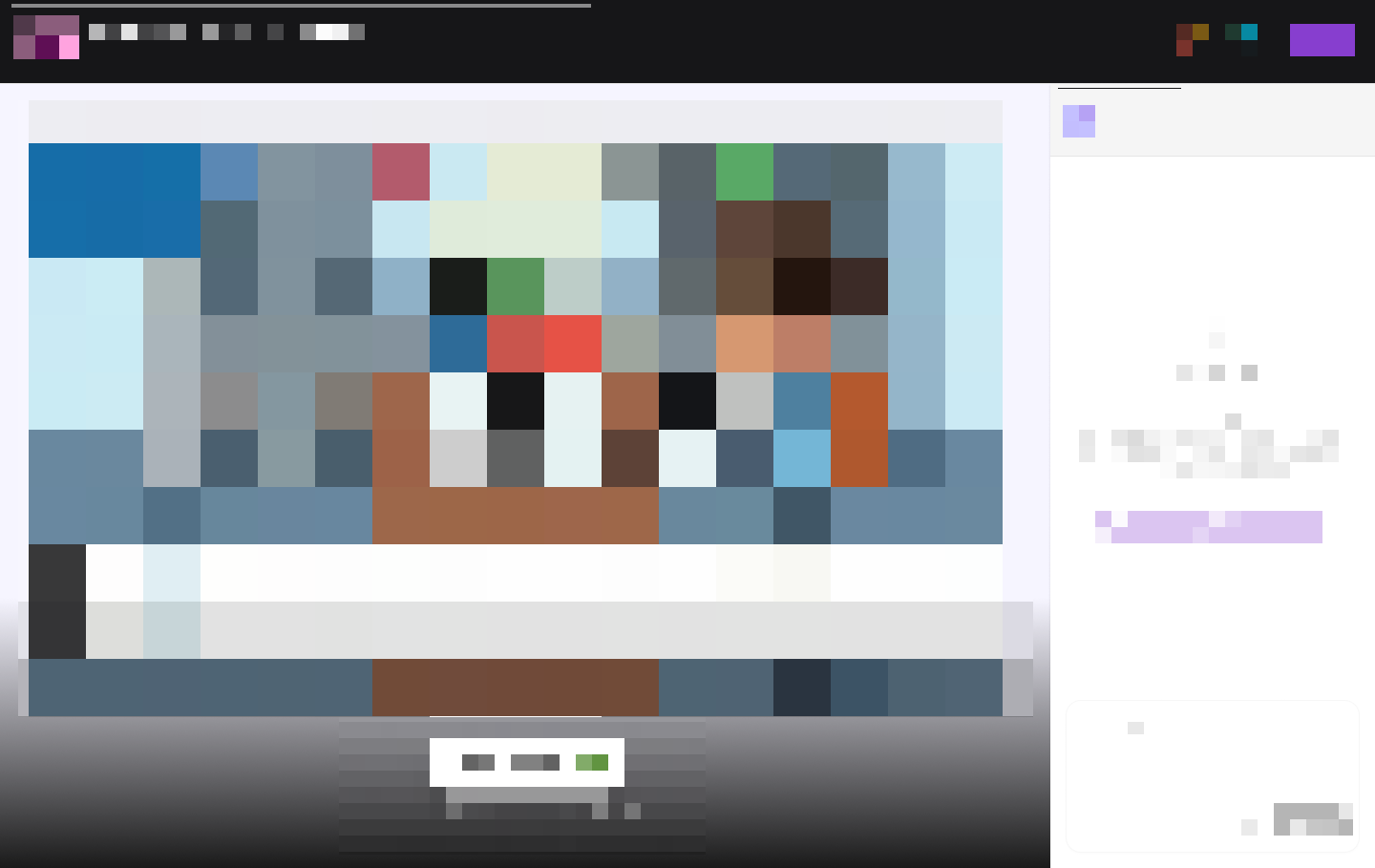
The learner-facing interface: designed to feel supportive and clear, never overwhelming
Designing for trust
on both sides.
Educators have to trust that the AI is responding safely with the people in their care. They need confidence that it's helping move things forward - not distracting their students, confusing them further, or - in the worst case - causing harm.
I was conscious throughout of the real-world stories about AI causing safety issues in contexts like this one. The risks of humanising AI, of unhealthy reliance forming, of responses given without appropriate guardrails. These weren't abstract concerns... they have honestly shaped almost every decision I've made about how the AI presents itself, how it's interacted with, and even the visuals we use to display inside the platform itself.
A design decision I pushed for
I advocated for a flagging system that hadn't been part of the original brief - not just content filtering, but an active system that surfaces signals an educator might otherwise never see.
Certain kinds of responses from learners are flagged quietly in the background. Signs of distress or potential harm are escalated as a higher priority, with the educator notified directly.
What started as a safeguarding consideration became one of the most meaningful parts of the product. Because in those moments, an AI paying close attention could surface something a human might never have had the chance to notice - or might never have heard, because it was never voiced anywhere but here.
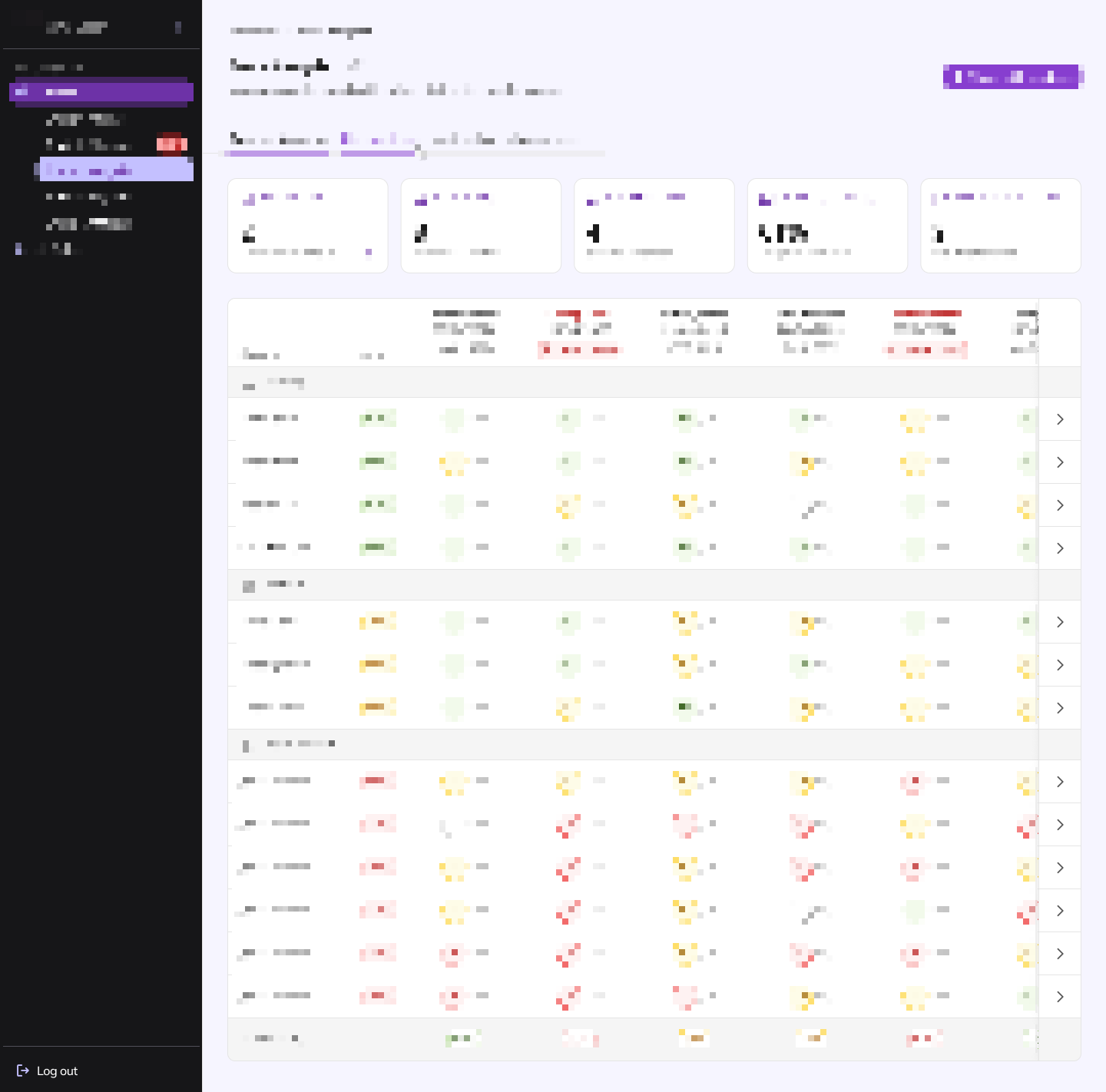
The educator-facing layer - surfacing meaningful insight without adding to an already stretched workload
Finding a home in
an existing product family.
This product needed to feel like it belonged within an existing family - using the same brand language, a shared design DNA - while having enough of its own identity to reflect how genuinely different it is in function and feel.
Finding that line required a lot of exploration & experimenting. The final design has its own visual character: familiar enough to feel trusted, but distinctive enough to signal that something genuinely new in the family of products is here.
The premiere
A world premiere.
A rush to the stage.
We showed the product for the first time at a major industry conference - the audience pouring out of the room were shown a mixture of a live beta of key pages and a prototype of additional flows, pulled together under real-time pressure. It was very much a total pre-launch and was absolutely imperfect in the way that live demos always are.
The reaction in the room was immediate.
"This does more than the tools we already use — and it looks easier to use than anything we've seen."
People rushed to the stage afterwards. An organisation in the room asked to purchase before the product was available to sell! The feedback wasn't just that it looked good - it was that it solved problems their existing tools don't touch, in a way that felt intuitive rather than clunky.
That response mattered beyond the validation. It told us that the experience we'd built (under a lot of constraint, in close daily collaboration, with a lot of fast decision-making) had communicated something clearly enough that people wanted it before it was even finished.
What I'm still thinking about
The questions this project is still asking me.
There are parts of this product I'm still actively iterating on. We are still working towards a closed beta launching in June. The line between helpful AI transparency and overwhelming the user with explanations of what the system is doing is one I haven't fully resolved. Getting that balance right, so that educators feel informed without needing a technical manual, is work I'm continuing as we move toward the closed beta launch.
The safeguarding system is also something I'd like to develop further. What we've built is meaningful. But the surface area for how an AI product could support wellbeing (not just flag concerns, but help people respond thoughtfully and quickly ) feels like it has much more to explore.
Designing for AI taught me something I didn't expect: the most important design decisions aren't about the interface at all. They're about what the system is allowed to do, how it communicates uncertainty, and how it behaves when something goes wrong. I know that this type of thinking will stay with me long after this product launches, and will weave a thread through everything I'm working on after that.
Back to work →
View all work